
Article: How to Use a Colour Wheel for Interior Design: A Complete Guide
How to Use a Colour Wheel for Interior Design: A Complete Guide
Choosing colours for a room can feel overwhelming. There are so many shades to pick from, and a wrong combination can make a space feel unsettled — even if you can't quite put your finger on why.
The good news? You don't need to have an eye for colour to get it right. You just need a simple tool that's been helping artists and designers for centuries: the colour wheel.

The colour wheel shows how colours relate to each other — which ones naturally go together, which ones create contrast, and which ones bring out the best in each other.
Once you understand how it works, choosing colours for your home becomes much less of a guessing game and much more of an enjoyable process.
In this guide, we'll walk you through how the colour wheel works, how to use it when designing a room, and how to apply a simple proportion rule that helps bring everything together.
In This Guide
- What is a colour wheel?
- How the colour wheel helps you design a room
- The 6 colour schemes and how to use them in interior design
- Beyond the hue: working with lightness and intensity
- Warm vs. cool: how colour temperature shapes a room
- Where is brown on the colour wheel?
- The 60-30-10 rule
- How to start
- Key takeaways
What is a colour wheel?
The colour wheel is a circular diagram that organises colours by how they connect.
There are actually several types of colour wheels used for different purposes (like RGB for screens or CMYK for printing), but the RYB colour wheel — red, yellow, blue — is the most widely used in art and interior design and the one we'll use throughout this guide.

At its core sit three primary colours — red, yellow, and blue. These can't be made by mixing other colours.
Combine two primaries, and you get a secondary colour: orange (red + yellow), green (yellow + blue), or purple (blue + red).
Then there are six tertiary colours, each made from one primary and its neighbouring secondary — yellow-orange, red-orange, red-purple, blue-purple, blue-green, and yellow-green.

That gives you 12 hues arranged in a circle.
Every colour you see in a room — from a dusty sage cushion to a terracotta vase — sits somewhere on this wheel.
Key takeaway: The colour wheel isn't about memorising every hue. It's about understanding the relationships between colours — which ones sit close together, which ones oppose each other. That's what makes it useful for decorating.
How the colour wheel helps you design a room
The colour wheel isn't just theory — it's genuinely useful in the kinds of situations most of us find ourselves in when decorating.
Starting from scratch
You're setting up a new room and staring at a blank canvas. Where do you even begin?

The colour wheel gives you tried-and-tested colour combinations (called colour schemes — we'll cover these below) so you have a clear starting point.
Instead of scrolling endlessly through inspiration photos, you can pick a scheme and know with confidence which colours will work well together across your walls, furniture, and accessories.
Building around something you already own
Maybe you have a beautiful teal sofa you love, or a warm rust-coloured rug that's staying.

The colour wheel helps here too — find your existing colour on the wheel, and it immediately shows you what would pair beautifully with it.
You can go for something soft and tonal, or choose a colour that creates a lively contrast. Either way, you're working with a clear direction rather than hoping things match.
When a room doesn't feel quite right
Sometimes a room just feels off, but it's hard to say why.

Everything might be the same intensity, making the space feel flat and lifeless. Or the colours might have no real connection to each other, creating a sense of visual restlessness.
The colour wheel can help you see what's happening — and what small change might bring everything into balance.
The 6 colour schemes and how to use them in interior design
A colour scheme is a framework for finding colours that work well together. It's based on colour harmony — the idea that certain positions on the colour wheel naturally create pleasing combinations, whether in a painting, a graphic design, or a room.
Instead of guessing which colours might look good side by side, a colour scheme gives you a proven starting point. Different positions on the wheel create different effects — some feel calm and cohesive, others feel bold and full of energy.
These are the six foundational colour schemes from colour theory, and how to apply them in interior design and decorating
1. Monochromatic
A monochromatic colour scheme is built around a single colour, used in lighter, darker, and more muted versions of itself.

A bedroom in layered blues — from pale ice on the walls to deep indigo on the bedding. Or an all-neutral living room using ivory, warm taupe, and charcoal.

There's something wonderfully calming about a monochromatic room. It feels considered and cohesive. But since there's no colour contrast doing the visual heavy lifting, texture becomes your best friend — think linen, wool, wood grain, ceramic. The richness comes from layering materials and playing with light and dark, not from introducing new colours.
Pros:
- Beginner-friendly — hard to get wrong
- Easy to create a clear, consistent mood
- Naturally cohesive, no clashing
Watch out for:
- Without colour contrast, the eye goes to texture, shape, and proportion — so your furniture, materials, and silhouettes need to carry the room
- Your single colour defines the entire mood of the space, so choose carefully and consider its colour psychology (a cool blue calms, a warm terracotta grounds, a soft pink softens — each will shape how the room feels to live in)
2. Analogous
An analogous colour scheme uses two to four colours that sit next to each other on the colour wheel.

Green, teal, and blue. Or ochre, orange, and warm red. Because these colours share a similar undertone, they feel naturally at home together — like colours you'd find in a landscape or a particular season.

This is one of the most forgiving schemes to work with, because neighbouring colours rarely clash. The one thing to watch for: if all your colours are at the same lightness, the room can feel a little flat. Mixing in lighter and darker versions of your chosen colours gives the space more depth and life.
Pros:
- Beginner-friendly — hard to get wrong
- Naturally harmonious (these are the colour combinations you see in nature — in a forest, a sunset, an autumn landscape)
- Creates a peaceful, calming atmosphere
Watch out for:
- Not much — analogous is one of the most risk-free schemes to work with
- Just make sure your colours vary in lightness, or the room can feel a little flat
3. Complementary
A complementary colour scheme pairs two colours that sit directly opposite each other on the colour wheel.

Think blue and orange. Or yellow and purple. Or red and green.
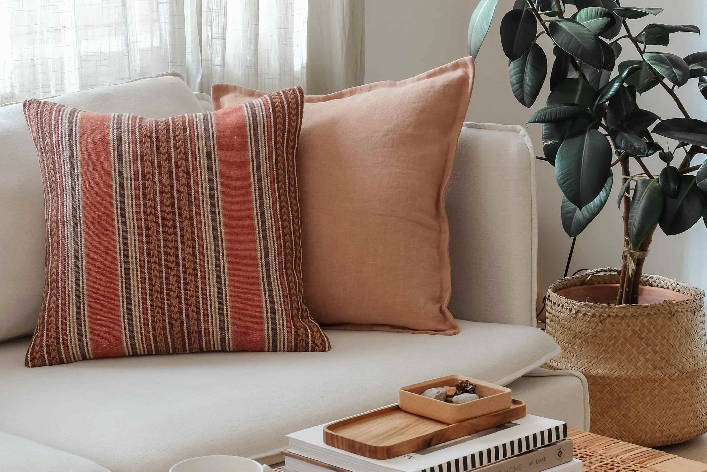
Because these colours sit as far apart on the wheel as possible, they bring out the best in each other — each one appears more vivid and alive in the other's company. Think of a navy sofa against a warm terracotta wall, or deep green walls paired with soft blush textiles. There's an energy to these combinations that feels confident and intentional.

One thing to keep in mind: complementary colours work best when one takes the lead and the other plays a supporting role. When both are used in equal amounts, they can start to compete for attention rather than enhancing each other.
Note: Colour theory isn't precise. Because there are slightly different colour wheels in use, you can shift left or right when picking your complement — the effect still works as long as the two colours sit far apart on the wheel.
Pro Tip: You don't have to limit yourself to just two colours. A little-known trick is to pick a few analogous colours and add a single complementary accent — think a room in layered greens with one warm red element. The result feels richer and more nuanced, while keeping the contrast that makes complementary schemes so striking.
Pros:
- Creates striking contrast and visual energy
- Simple to apply — just pick two colours sitting roughly opposite on the wheel (no need to be exact)
Watch out for:
- Works best when one colour dominates, and the other plays a supporting role — equal amounts can feel like the two colours are competing rather than enhancing each other
4. Split-Complementary
A split-complementary scheme takes one main colour and pairs it with the two colours that sit on either side of its opposite.

Say your starting colour is blue. Its complement would be orange — but instead of orange, you pick the two colours next to orange: yellow-orange and red-orange.

The result is a palette that still has lovely contrast, but feels richer and a little more nuanced than a straight complementary pair. You have three colours to work with instead of two, and because the accent colours sit close to each other on the wheel, they work together rather than pulling in different directions.
It's a beautiful option when you want a room to feel thoughtfully layered — colourful, but not overdone.
Pros:
- Colourful and complete look, without feeling chaotic
- Pleasing and energising — more nuance than a straight complementary pair
Watch out for:
- Works best when your single main colour takes the lead, with the two opposing colours used as accents rather than equal partners
5. Triadic
A triadic colour scheme uses three colours that are evenly spaced around the wheel, forming a triangle.

Orange, green, and purple. Or red, yellow, and blue.

Three colours from completely different parts of the wheel give you a wonderful variety — but all that variety needs a careful hand. At full intensity, a triadic palette can feel a bit too lively for most living spaces. The secret is to let one colour take the lead and keep the other two softer or smaller — a muted lamp shade, a few carefully chosen vases, a stack of book spines on a shelf.
Pros:
- Rich, complete look with plenty of visual interest
- Very colourful and full of energy
Watch out for:
- Best when one or two colours dominate, and the third plays a supporting role — using all three equally can feel restless
- Keep an eye on saturation. If all three colours are at full intensity, the room can start to look cartoony. Muted or desaturated versions usually work better at home.
6. Tetradic (Double Complementary)
A tetradic scheme uses four colours arranged as two complementary pairs, forming a rectangle on the wheel.

This is the most adventurous scheme — and the one that takes the most care to get right. Four distinct hues give you a rich palette to work with, but they can easily overwhelm a space if they're all competing for attention.

The approach that works best: let one complementary pair set the overall tone of the room (your walls, your main furniture), and bring in the second pair through smaller, more intentional touches — a piece of artwork, a throw, a few carefully placed decorative objects.
Pro Tip: Tetradic can be lovely for dividing a larger space into visual zones. Use one complementary pair in one part of the room (say, a reading corner) and the other pair in another (a dining nook). The two pairings give each zone its own personality, while the shared structure keeps the overall space feeling cohesive.
Pros:
- The most colour-rich scheme — ideal if you're drawn to layered, expressive interiors
- Works beautifully for dividing a larger space into distinct visual zones, each with its own contrasting pair
Watch out for:
- Easily the most advanced scheme to work with — it takes a careful eye to balance four hues
- Avoid using all four colours equally. Without a clear hierarchy, the room can quickly feel wild and overwhelming.
Beyond the hue: working with lightness and intensity
The colour wheel is wonderful for showing you which hues go together. But here's the thing — in a real room, you're almost never working with the pure, bright colours you see on the diagram.
The green on your wall is probably softer, dustier, lighter — or deeper and moodier than anything on the wheel. That's because every colour has two other dimensions you can play with: how light or dark it is, and how vivid or muted it is.
Make a colour lighter (by adding white) and you get what's called a tint — think blush pink, powder blue, or mint green. Make it darker (by adding black) and you get a shade — burgundy, navy, forest green. Lower the vividness (by adding grey) and you get a tone — the soft, muted colours that dominate most interiors: dusty rose, slate blue, sage.
This is why two rooms can use the exact same colour scheme but look completely different. One might use bright, saturated hues. The other might use toned-down, earthy versions of those same hues.
When you're building a palette for a room, think of it this way: the colour wheel helps you choose the hues. Lightness and intensity help you set the mood.
Practical tip: If a room feels too intense, you don't need to start over with new colours — just go softer. Muted, toned-down versions of the same hues are much easier to live with day-to-day, and they bring a lovely sense of calm to a space. Save the brighter, more vivid shades for small accents where they can really shine.
Warm vs. cool: how colour temperature shapes a room
If you look at the colour wheel, you can split it roughly in half — and each half creates a very different feeling in a room.
Warm colours — reds, oranges, yellows — make a space feel cosy, inviting, and full of life. They seem to come toward you visually, which gives rooms a sense of closeness and intimacy.
Cool colours — blues, greens, purples — have the opposite effect. They create a feeling of openness, calm, and breathing room. They seem to recede, which is why they can make a space feel larger than it is.
This is one of the most useful things the colour wheel can show you. If you have a north-facing room that always feels a little cold, warming it up with ochre, terracotta, or rich wood tones can make a real difference. If a small room feels cramped, soft blues and sage greens can help it feel more open and restful.
Most rooms feel their best when one temperature leads — either warm or cool — with a few touches of the opposite to add depth and keep things interesting.
Where is brown on the colour wheel?
Look at the colour wheel and you'll notice something: where's brown? It's one of the most common colours in interior design, yet it's nowhere to be seen on the standard wheel. Neither are olive or cream — other everyday interior colours.
The short answer: they're all there, just in disguise.
Brown is dark, muted orange. Take orange, lower the brightness, pull back the intensity, and you get everything from chocolate to caramel to tan. A brown leather sofa isn't a neutral in colour wheel terms — it's in the orange family.
Olive is dark, muted yellow. It can read as yellow-green, but its roots are closer to yellow than most people realise. That's why olive pairs so beautifully with warm tones — it carries warmth underneath.
Cream is a very light, low-intensity yellow or orange. A tint with the saturation pulled way down — which is why cream walls feel warm and inviting rather than cold.
Why does this matter for a room? Because once you know where your everyday colours actually live on the wheel, you can plan around them properly. A brown sofa's complement is blue. Olive's complement is purple. Cream's analogous neighbours are soft peaches and buttery yellows.
Seeing everyday interior colours through this lens makes the wheel far more useful in a real home.
The 60-30-10 rule
Choosing the right colours is half the picture. The other half? How much of each colour you use.
This is where the 60-30-10 rule comes in — a simple proportion guide that interior designers rely on to get the balance right:
- 60% — the dominant colour (walls, large furniture, rugs)
- 30% — the secondary colour (upholstery, curtains, smaller furniture)
- 10% — the accent colour (cushions, artwork, decorative objects)
For example: 60% warm white walls, 30% soft sage sofa and linen curtains, 10% brass accessories and a few mustard-toned cushions.
Typically, the dominant colour is something neutral or soft — it sets the backdrop without demanding attention. The secondary colour adds warmth and character. And the accent colour is where you have the most fun — it's usually the most vivid of the three, the detail that catches your eye.
Don't worry about getting the proportions exact. The numbers are a guideline, not a strict rule. What matters is the principle: one colour leads, one supports, one adds a finishing touch. That's what gives a room a sense of balance.
How to Start
If all of this feels like a lot to take in, here's a simple process to follow when you're ready to put it into practice.
- Start with one colour you love. It could be something already in your home — a piece of furniture, a favourite rug, even a cushion that makes you smile. That's your anchor.
- Find it on the wheel. Once you know where your colour sits, you can immediately see what's nearby (for a soft, harmonious feel), what's opposite (for a bolder contrast), and what sits in a triangle or rectangle around it (for something more layered).
- Pick a colour scheme. Want something calm and cohesive? Try analogous or monochromatic. Want a bit more energy? Complementary or split-complementary are lovely options. If you're not sure, start simple and add more colour as you go.
- Think about proportions. Use the 60-30-10 rule as a starting point — it helps you decide how much of each colour to bring into the room.
- Test everything in real light. Colours can look surprisingly different on a screen compared to real life, and they shift again between daylight and lamplight. Whenever possible, get fabric swatches and paint samples and see how they look in the actual room before you commit.
Above all, trust your instincts. The colour wheel is a wonderful guide, but it's not a rule book. If a combination feels right in your space, it almost certainly is.
Key Takeaways
- The colour wheel arranges 12 hues in a circle based on how they relate — close together means harmonious, far apart means contrasting.
- Use it to build a room from scratch, find colours that work with something you already own, or diagnose why a room feels off.
- Six colour schemes — monochromatic, analogous, complementary, split-complementary, triadic, and tetradic — cover virtually every decorating scenario.
- Every colour has three dimensions: hue (the colour itself), lightness (how bright or dark), and intensity (how vivid or muted). Adjusting lightness and intensity is how you go from a colour wheel hue to a real interior colour.
- Common interior colours like brown, olive, and cream are all on the wheel — just darkened or desaturated versions of orange and yellow.
- Warm colours make rooms feel intimate; cool colours make them feel spacious and calm.
- The 60-30-10 rule keeps your proportions balanced: one colour dominates, one supports, one accents.
- Start with one colour you love and let the wheel show you where to go from there.